I have been testing several of the “custom-script” S1 algorithms in our Open Data Cube environment. Many of them are quite nice and run well. I have questions about two of them and could use some explanation.
Urban Areas by Monja Sebela: This algorithm uses a simple RGB function, where … Red = 5.5 * VH > 0.5, Green = VV and Blue = VH*8. What does the inequality function mean in the Red band? Looking at typical VH power levels for an agricultural region (0.1 to 0.3), the Red band value might be 0.55 to 1.65 for this algorithm. So how does the inequality impact the RGB output?
SAR False Color Visualization by Annamaria Luongo: The script creates an RGB image using several constants (c#) and functions of the VV and VH bands. The Blue band for this algorithm is causing issues. Blue = 0.8 - Math.log (c6 / (c5 - c7 * VV)) where c6=0.05, c5=0.045 and c7=0.9. Since VV is positive and typically 0.2 to 0.5 (power numbers for agriculture), then the value of the function (c5 - c7*VV) is negative. So, we cannot take the LOG of a negative number.
the first band in the urban area script is a simple boolean condition, which returns 0 for false and 1 for true.
So this:
return [5.5 * VH > 0.5, VV, VH * 8];
Is the same as
var val;
if (5.5 * VH > 0.5) val = 1;
else val = 0;
return [val, VV, VH * 8];
@monja.sebela can better explain how she got these values but my interpretation of the script would be that urban structures have small VH and will result in red band being 0.
Dear Brian,
Thanks for your interest in my script.
Your comments are right. However, my script has only the scope of Earth visualization in false colour (not for quantitative purpose). When I developed this script (for students terrified by SAR because they could not understand the objects of the images), I decided to obtain sea / water in (some) blue tones and I focused on negative value (if you use only band3, my idea is clear).
Anyway, I suggest putting band3=0 and also using single bands (in particular the combination 1-band2, for me is amazing).
Thanks for the reply. I too, was only planning to use your script for visualization of data. I will take your suggestion about band3=0. As for your other suggestion (using single bands), can you explain more what you mean by “1-band2”? Are you suggesting a calculation where I use your band2 algorithm and subtract from 1? For viewing a single band, I typically use single color scaling, such as “blues”, “reds” or “greens”. Is that what you are thinking?
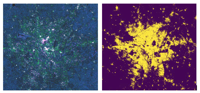
The SAR Urban script values were obtained from experimentation and comparison of the results with the true color image to highlight urban areas as well as possible. Some buildings highly reflect VV, which was input into the green channel, and other buildings reflect VH values. To separate buildings from barren soil and mountan areas, I limited the red band to only highly reflected values of higher than 0.5 VH. VH was also input into he blue channel and left as is, so that these areas are colored blue, and highly reflective ones (buildings) mix with the red channel, producing purple buildings. Buildings are thus either purple (reflecting VH), green (reflecting VV) or white (reflecting both) based on the building structure/material. The bands were multiplied by 5.5 and 8 for aesthetic purposes.
Thanks Monja. I have the script running now and the results look pretty good. Below is a look at Kumasi, Ghana using your script (left) against the Global Human Settlement Layer (GHSL) product (right). - Brian