We are using the sentinel configurator to configure satellite layers and then we display these layers as a wms layer in our portal. We are struggling to display a legend for these layers. I followed the exact steps explained in https://www.sentinel-hub.com/faq/how-define-custom-legend without any luck. What am I missing? Any advice will be appreciated
Hi Juan, if you have added the “legend” object in the parent “styles” within your JSON configuration, you should be able to see the legend in the EO Browser (Sentinel Hub EO Browser). Log in and, in the search tab, choose the theme based on your configuration (from the dropdown menu). You should be able to see the legend as in attached example.

If the legend image is shown, you have configured the legend correctly.
As for displaying the legend in your WMS portal please provide some more details such as the specific url that the portal is using when trying to load the legend. Example:
https://services.sentinel-hub.com/ogc/wms/{instanceID}
?service=WMS&request=GetLegendGraphic&layer=MOISTURE-INDEX&height=200&width=100
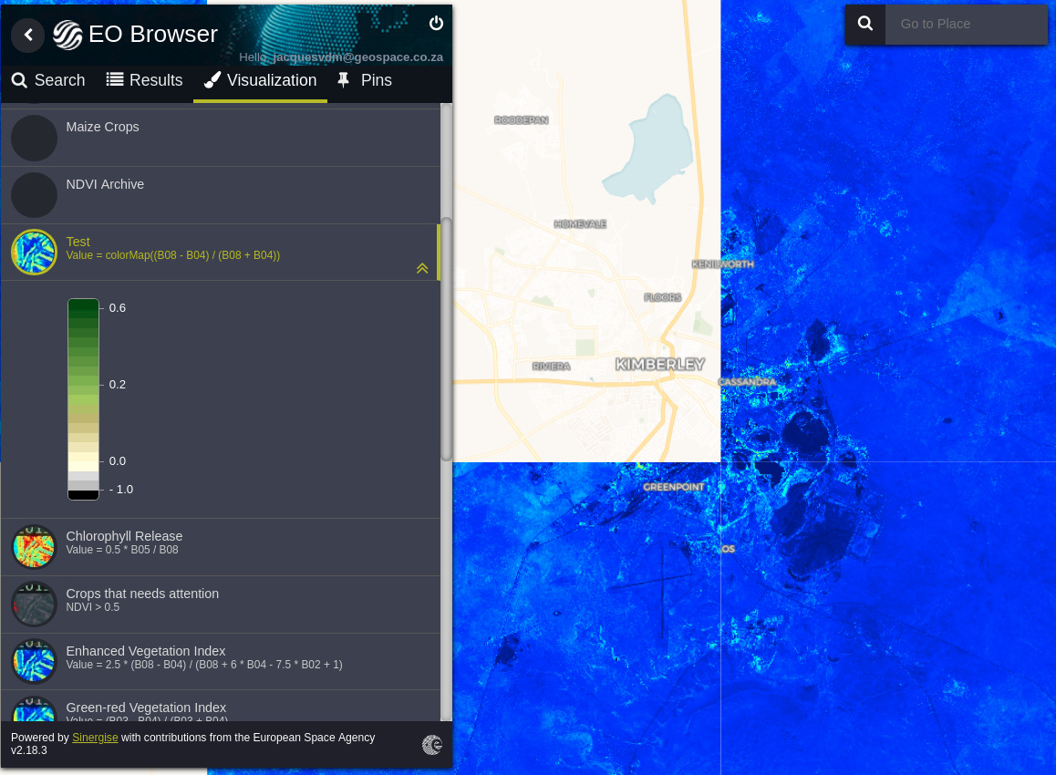
Thank you very much for the help. So now I can see the legend in the playgroud. How can I set my legend to automatically get the colors displayed. See below the legend code and the image. If I need to configure the colors manually how do I now how many classes, rgb codes etc.
“legend”: {
“type”: “continuous”,
“minPosition”: 0,
“maxPosition”: 1.05,
“gradients”: [
{
“position”: 0,
“color”: “rgb(0%,0%,0%)”
},
{
“position”: 0.05,
“color”: “rgb(0%,0%,0%)”,
“label”: “- 1.0 High saturation objects”
},
{
“position”: 0.050001,
“color”: “rgb(75%,75%,75%)”
},
{
“position”: 0.1,
“color”: “rgb(75%,75%,75%)”
},
{
“position”: 0.10001,
“color”: “rgb(86%,86%,86%)”
},
{
“position”: 0.15,
“color”: “rgb(86%,86%,86%)”
},
{
“position”: 0.150001,
“color”: “rgb(100%,100%,88%)”
},
{
“position”: 0.2,
“color”: “rgb(100%,100%,88%)”,
“label”: “0.0 Crops that needs attention”
},
{
“position”: 0.20001,
“color”: “rgb(100%,98%,80%)”
},
{
“position”: 0.25,
“color”: “rgb(100%,98%,80%)”
},
{
“position”: 0.250001,
“color”: “rgb(93%,91%,71%)”
},
{
“position”: 0.3,
“color”: “rgb(93%,91%,71%)”
},
{
“position”: 0.30001,
“color”: “rgb(87%,85%,61%)”
},
{
“position”: 0.35,
“color”: “rgb(87%,85%,61%)”
},
{
“position”: 0.350001,
“color”: “rgb(80%,78%,51%)”
},
{
“position”: 0.4,
“color”: “rgb(80%,78%,51%)”
},
{
“position”: 0.40001,
“color”: “rgb(74%,72%,42%)”
},
{
“position”: 0.45,
“color”: “rgb(74%,72%,42%)”
},
{
“position”: 0.450001,
“color”: “rgb(69%,76%,38%)”
},
{
“position”: 0.5,
“color”: “rgb(69%,76%,38%)”
},
{
“position”: 0.50001,
“color”: “rgb(64%,80%,35%)”
},
{
“position”: 0.55,
“color”: “rgb(64%,80%,35%)”
},
{
“position”: 0.550001,
“color”: “rgb(57%,75%,32%)”
},
{
“position”: 0.6,
“color”: “rgb(57%,75%,32%)”,
“label”: “0.2 Average crops”
},
{
“position”: 0.60001,
“color”: “rgb(50%,70%,28%)”
},
{
“position”: 0.65,
“color”: “rgb(50%,70%,28%)”
},
{
“position”: 0.650001,
“color”: “rgb(44%,64%,25%)”
},
{
“position”: 0.7,
“color”: “rgb(44%,64%,25%)”
},
{
“position”: 0.70001,
“color”: “rgb(38%,59%,21%)”
},
{
“position”: 0.75,
“color”: “rgb(38%,59%,21%)”
},
{
“position”: 0.750001,
“color”: “rgb(31%,54%,18%)”
},
{
“position”: 0.8,
“color”: “rgb(31%,54%,18%)”
},
{
“position”: 0.80001,
“color”: “rgb(25%,49%,14%)”
},
{
“position”: 0.85,
“color”: “rgb(25%,49%,14%)”
},
{
“position”: 0.850001,
“color”: “rgb(19%,43%,11%)”
},
{
“position”: 0.9,
“color”: “rgb(19%,43%,11%)”
},
{
“position”: 0.90001,
“color”: “rgb(13%,38%,7%)”
},
{
“position”: 0.95,
“color”: “rgb(13%,38%,7%)”
},
{
“position”: 0.950001,
“color”: “rgb(6%,33%,4%)”
},
{
“position”: 0.990001,
“color”: “rgb(6%,33%,4%)”
},
{
“position”: 1,
“color”: “rgb(0%,27%,0%)”,
“label”: “0.6 Good crops”
},
{
“position”: 1.05,
“color”: “rgb(0%,27%,0%)”
}
]
}
},
{
Hi Juan,
you will need to configure colors in a legend and manually. You have the freedom to configure colors, their positions and labels in the legend to best suit your data. How many classes you want to show is also your decision. From your print screen it seems you use continuous color scale, so you will probably want to use "type": "continuous" for your legend.
The colors you want to display in a legend depend on the custom script you use for visualization of the data. If you are using Sentinel Hub’s visualizers, you can find the documentation here: https://docs.sentinel-hub.com/api/latest/#/Evalscript/functions?id=visualizers This shall enable you to understand which value is mapped to which color.
You can use various formats to specify the colors: 1) HEX code (e.g., "color": "#002863"), 2) rgb values in range 1% - 100% (e.g.,"color": "rgb(0%, 16%, 39%)", or 3) rgb values in range 0 - 255 (e.g., "color": "rgb(0, 40, 99)"). Although, I am not sure if this answers your qustion.
Thank you very for the help. Much appreciated. I was able to create the legend just as I wanted through the help of the forum